本節の導入
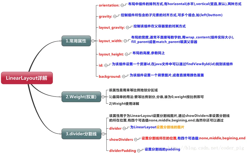
この節ではAndroidのレイアウトについて説明します。Androidには6大レイアウトがあります。それぞれは: LinearLayout(線形レイアウト)、RelativeLayout(相対レイアウト)、TableLayout(テーブルレイアウト) FrameLayout(フレームレイアウト)、AbsoluteLayout(絶対レイアウト)、GridLayout(グリッドレイアウト)です。 今日説明するのは最初のレイアウト、LinearLayout(線形レイアウト)です。画面サイズへの対応でよく使われるのはLinearLayoutのweight(重み属性)です。この節では、LinearLayoutを詳しく解析します。基本的な属性、Weight属性の使い方、比率の計算方法に加えて、あまり使われない属性:android:dividerによる下線の描画についても説明します。
1. 本節の学習図
2. weight(重み)属性の詳細:
①最も簡単な使い方:
図のように:
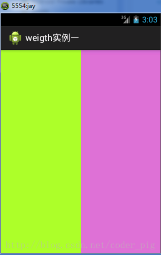
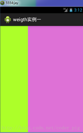
実装コード:
<LinearLayout xmlns:android="http://schemas.android.com/apk/res/android"
    xmlns:tools="http://schemas.android.com/tools"
    android:id="@+id/LinearLayout1"
    android:layout_width="match_parent"
    android:layout_height="match_parent"
    android:orientation="horizontal">

    <LinearLayout
        android:layout_width="0dp"
        android:layout_height="fill_parent"
        android:background="#2F97FF"
        android:layout_weight="1"/>


    <LinearLayout
        android:layout_width="0dp"
        android:layout_height="fill_parent"
        android:background="#DA70D6"
        android:layout_weight="2"/>

</LinearLayout>
最初の1:1の効果を実現するには、2つのLinearLayoutのweightをそれぞれ1と1に変更するだけです。 使い方のまとめ: 水平方向を比率で分割する:関係するViewのandroid:width属性を0dpに設定し、次にandroid weight属性に比率を設定します。同様に、垂直方向はandroid:heightを0dpにして、weight属性を設定するだけです! 自分で垂直方向の等比率分割を書いて、簡単な使い方を体験してみてください。
② weight属性の詳細:
もちろん、上記のような0dpに設定する方法を使わず、直接wrap_contentとmatch_parentを使う場合は、weight属性をさらに解析する必要があります。wrap_contentとmatch_parentの2つのケースに分けられます。また、LinearLayoutのorientationが水平か垂直かを見る必要があります。これによって、どの方向で等比率分割するかが決まります。
1) wrap_contentは比較的簡単で、直接比率に従います。

実装コード:
<LinearLayout xmlns:android="http://schemas.android.com/apk/res/android"
    xmlns:tools="http://schemas.android.com/tools"
    android:id="@+id/LinearLayout1"
    android:layout_width="match_parent"
    android:layout_height="match_parent"
    android:orientation="horizontal" >

    <TextView
        android:layout_weight="1"
        android:layout_width="wrap_content"
        android:layout_height="fill_parent"
        android:text="one"
        android:background="#8AC3FB"
     />
     <TextView
        android:layout_weight="2"
        android:layout_width="wrap_content"
        android:layout_height="fill_parent"
        android:text="two"
        android:background="#FFFF00"
     />
     <TextView
        android:layout_weight="3"
        android:layout_width="wrap_content"
        android:layout_height="fill_parent"
        android:text="three"
        android:background="#FF00FF"
     />

</LinearLayout>
2) match_parent(fill_parent):これは計算が必要です。
この簡単なコードを書いてみます:
<LinearLayout xmlns:android="http://schemas.android.com/apk/res/android"
    xmlns:tools="http://schemas.android.com/tools"
    android:id="@+id/LinearLayout1"
    android:layout_width="match_parent"
    android:layout_height="match_parent" >

    <TextView
        android:layout_weight="1"
        android:layout_width="fill_parent"
        android:layout_height="fill_parent"
        android:text="one"
        android:background="#8AC3FB"
     />
     <TextView
        android:layout_weight="2"
        android:layout_width="fill_parent"
        android:layout_height="fill_parent"
        android:text="two"
        android:background="#FFFF00"
     />
     <TextView
        android:layout_weight="3"
        android:layout_width="fill_parent"
        android:layout_height="fill_parent"
        android:text="three"
        android:background="#FF00FF"
     />

</LinearLayout>
実行結果図:
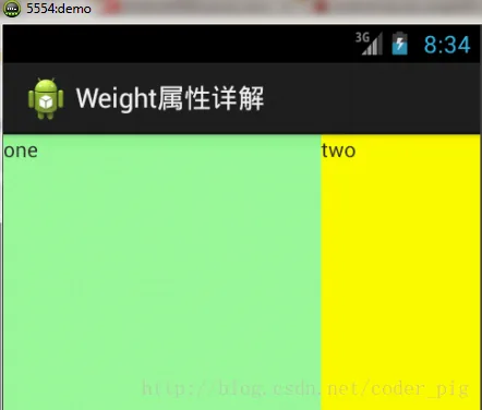
この時点で疑問が湧きます。どうしてこうなるのか?この比率は2:1ですよね?ではthreeはどこへ行ったのでしょう?コードには明らかにthreeがあるし、3も設定しているのに、1と2の比率もおかしいです。1:2:3が2:1:0になってしまいました。なぜなのでしょうか? 答え:ここは実はそれほど単純ではなく、計算が必要です。ネット上にはいくつかのアルゴリズムがありますが、ここでは筆者が理解しやすいと思うものを紹介します:step 1:すべてがfill_parentですが、画面は1つしかありません。すると 1 - 3 = -2 fill_parent になります。step 2:各比率は順に 1/6、2/6、3/6 です。step 3:早い者勝ちです。最初にoneに割り当てます。計算: 1 - 2 * (1/6) = 2/3 fill_parent 次にtwoに割り当てます。計算: 1 - 2 * (2/6) = 1/3 fill_parent 最後にthreeに割り当てます。計算: 1 - 2 * (3/6) = 0 fill_parentstep 4:したがって最終結果は、oneが2つ分、twoが1つ分、threeは何もありません。 以上が、threeが表示されなかった理由です。皆さんはまだ少し混乱しているかもしれませんが、大丈夫です。もう少し例を挙げて試してみれば分かります!
比率:1:1:1
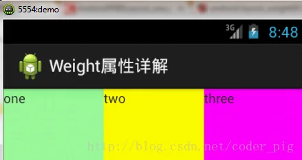
上記の計算方法で一度計算すると、結果は 1/3、1/3、1/3 となり、正しいです。
次に、2:3:4 で試してみます。
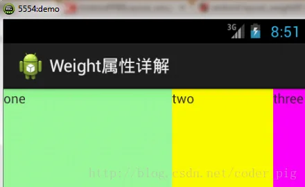
計算結果は 5/9、3/9、1/9 で、効果図と比較すると 5:3:1 であり、これも正しいです。だからこの計算方法はしっかり覚えておきましょう!
③ Javaコードでweight属性を設定する:
setLayoutParams(new LayoutParams(LayoutParams.FILL_PARENT,
        LayoutParams.WRAP_CONTENT, 1));
3. LinearLayoutに区切り線を設定する
多くのUI開発では、下線や区切り線を設定して、インターフェースをより整然として美しくします。例えば、下のKugou Musicの登録ページです:
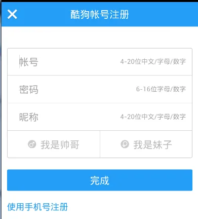
このような線に対して、通常のやり方は2つあります。① レイアウトにviewを直接追加する、このviewの役割は単に線を表示するだけであり、コードも非常に簡単です:
<View
    android:layout_width="match_parent"
    android:layout_height="1px"
    android:background="#000000" />
これは水平方向の黒い線です。もちろん他の色に変更したり、画像を使用したりすることもできます。

② 2つ目は、LinearLayoutのdivider属性を使用する方法です。、LinearLayoutに直接区切り線を設定します。 ここでは自分で線の画像を準備する必要があります。 1) android:divider で区切り線として使用する画像を設定します。 2) android:showDividers で区切り線の位置を設定します。none(なし)、beginning(開始)、end(終了)、middle(各2つのコンポーネントの間)です。 3) dividerPadding で区切り線のPaddingを設定します。
使用例:
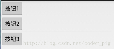
実装コード:
<LinearLayout xmlns:android="http://schemas.android.com/apk/res/android"
    xmlns:tools="http://schemas.android.com/tools"
    android:id="@+id/LinearLayout1"
    android:layout_width="match_parent"
    android:layout_height="match_parent"
    android:divider="@drawable/ktv_line_div"
    android:orientation="vertical"
    android:showDividers="middle"
    android:dividerPadding="10dp"
    tools:context="com.jay.example.linearlayoutdemo.MainActivity" >

    <Button
        android:layout_width="wrap_content"
        android:layout_height="wrap_content"
        android:text="按钮1" />

    <Button
        android:layout_width="wrap_content"
        android:layout_height="wrap_content"
        android:text="按钮2" />

    <Button
        android:layout_width="wrap_content"
        android:layout_height="wrap_content"
        android:text="按钮3" />

</LinearLayout>
4. LinearLayoutの簡単な例:
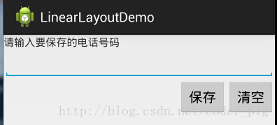
実装コードは次のとおりです:
<LinearLayout xmlns:android="http://schemas.android.com/apk/res/android"
    xmlns:tools="http://schemas.android.com/tools"
    android:id="@+id/LinearLayout1"
    android:layout_width="fill_parent"
    android:layout_height="fill_parent"
    android:orientation="vertical"
    tools:context=".MainActivity" >

    <TextView
        android:layout_width="wrap_content"
        android:layout_height="wrap_content"
        android:text="请输入要保存的电话号码"/>
    <EditText
        android:layout_width="fill_parent"
        android:layout_height="wrap_content"/>
    <LinearLayout
        android:layout_width="fill_parent"
        android:layout_height="wrap_content"
        android:orientation="horizontal"
        android:gravity="right">
        <Button
            android:layout_width="wrap_content"
            android:layout_height="wrap_content"
            android:text="保存"/>
        <Button
            android:layout_width="wrap_content"
            android:layout_height="wrap_content"
            android:text="清空"/>
    </LinearLayout>
</LinearLayout>
5. 注意事項:
layout_gravityを使用する上で非常に重要な問題!!! 問題の内容: 水平方向のLinearLayoutの中に2つのTextViewを配置し、1つを左に、もう1つを右にしたい場合、どうすればよいでしょうか? おそらく「gravityを1つはleft、もう1つはrightに設定すればいいんだ!」とすぐに口にするでしょう。 本当にそんなに簡単ですか?試したことはありますか?簡単なレイアウトを書くと、期待に反することが分かります。 コードは次のとおりです:
<LinearLayout xmlns:android="http://schemas.android.com/apk/res/android"
    xmlns:tools="http://schemas.android.com/tools"
    android:layout_width="match_parent"
    android:layout_height="match_parent"
    android:orientation="horizontal"
    tools:context="com.jay.example.getscreendemo.MainActivity" >

    <TextView
        android:layout_width="wrap_content"
        android:layout_height="200dp"
        android:layout_gravity="left"
        android:background="#FF7878"
        android:gravity="center"
        android:text="O(∩_∩)O哈哈~" />

    <TextView
        android:layout_width="wrap_content"
        android:layout_height="200dp"
        android:layout_gravity="right"
        android:background="#FF7428"
        android:gravity="center"
        android:text="(*^__^*) 嘻嘻……" />

</LinearLayout>
実行結果図:
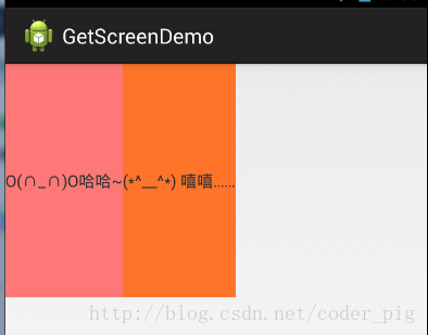
これを見て「ああ、本当にダメだね。外側のLinearLayoutにgravity=left属性を追加して、2つ目のTextViewのlayout_gravityをrightに設定してみよう」と言うかもしれません。では、試してみましょう:
<LinearLayout xmlns:android="http://schemas.android.com/apk/res/android"
    xmlns:tools="http://schemas.android.com/tools"
    android:layout_width="match_parent"
    android:layout_height="match_parent"
    android:orientation="horizontal"
    android:gravity="left"
    tools:context="com.jay.example.getscreendemo.MainActivity" >

    <TextView
        android:layout_width="wrap_content"
        android:layout_height="200dp"
        android:background="#FF7878"
        android:gravity="center"
        android:text="O(∩_∩)O哈哈~" />

    <TextView
        android:layout_width="wrap_content"
        android:layout_height="200dp"
        android:layout_gravity="right"
        android:background="#FF7428"
        android:gravity="center"
        android:text="(*^__^*) 嘻嘻……" />

</LinearLayout>
結果はやはり同じです:
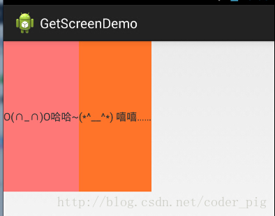
では、手詰まりですね。どうすればいいでしょうか?
android:orientation="vertical" の場合、水平方向の設定のみが有効になり、垂直方向の設定は無効になります。 つまり、left、right、center_horizontal が有効です。 android:orientation="horizontal" の場合、垂直方向の設定のみが有効になり、水平方向の設定は無効になります。 つまり、top、bottom、center_vertical が有効です。
しかし、この方法はあまり役に立たないようです。例えば、 垂直方向の左右整列しか設定できない場合、次のような効果になります:
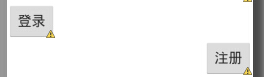
これは明らかに私たちが望む結果ではありません! まとめると、上記のルールに従ってレイアウトするか、このような場合は相対レイアウトRelativeLayoutを使うのが良いでしょう! ネット上には具体的な理由はなく、「このように変更すると、orientationの優先順位に関係している」と言う人もいます。 ひとまずメモしておきましょう。後で理由が分かればまた説明します!前に画面サイズへの対応でも述べましたが、レイアウトはやはりRelativeLayoutを使うことをお勧めします!